Company logo

Built by Shannon

Shannon McIntosh's avatar
Shannon McIntosh
Software Engineer @ CommandBar
GitHub logoLinkedIn logo
🚀13
May 19, 2024

🔮 Know thy user

Shannon McIntosh's avatar
Thomas Kainrad's avatar

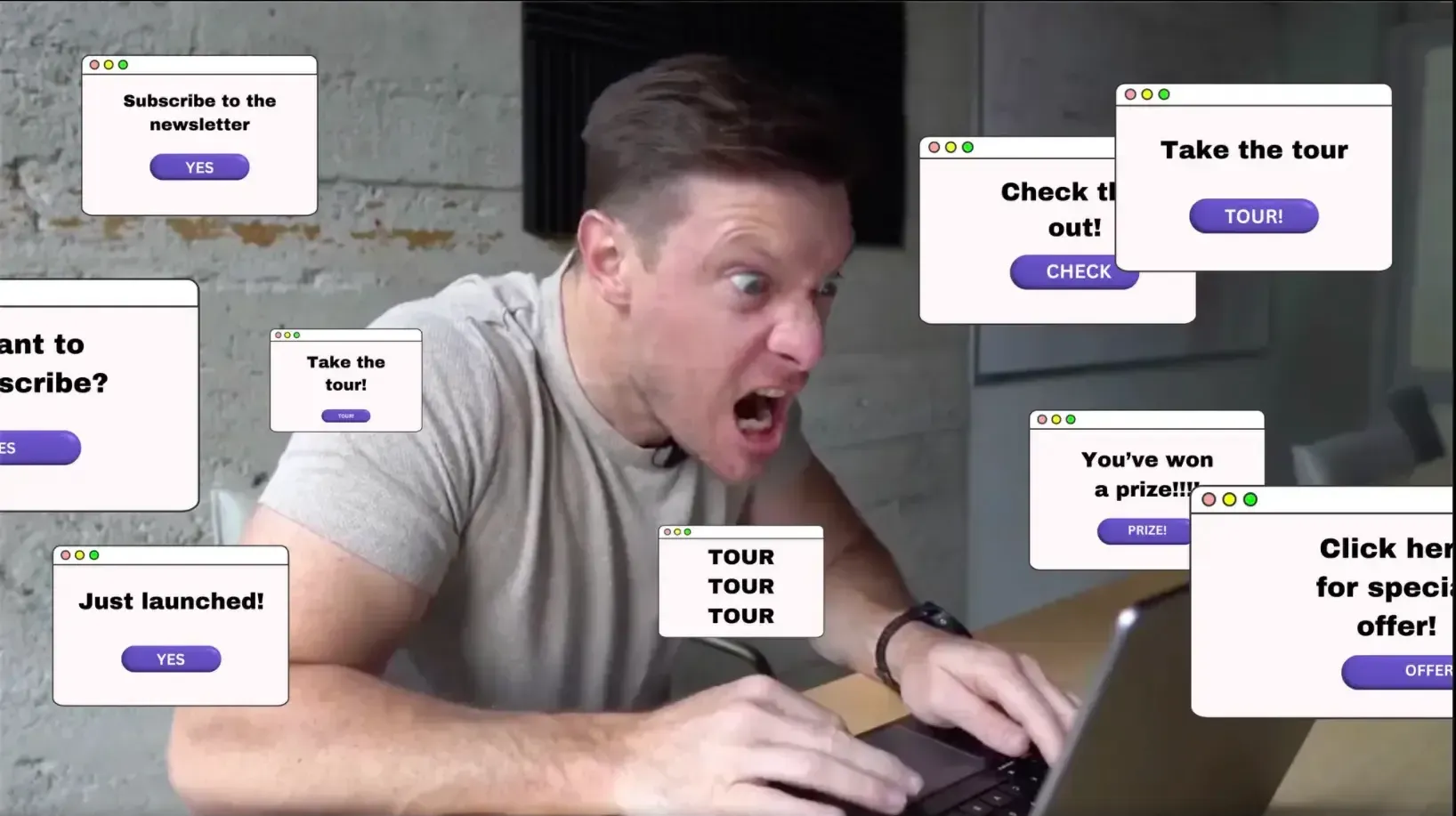
Plot twist: Users don't actually hate pop-ups. They hate irrelevant, mistimed, interrupting pop-ups. And that's basically all pop-ups.

But if you can make your in-app messaging NOT irrelevant, mistimed, and interrupting... users will find it useful!

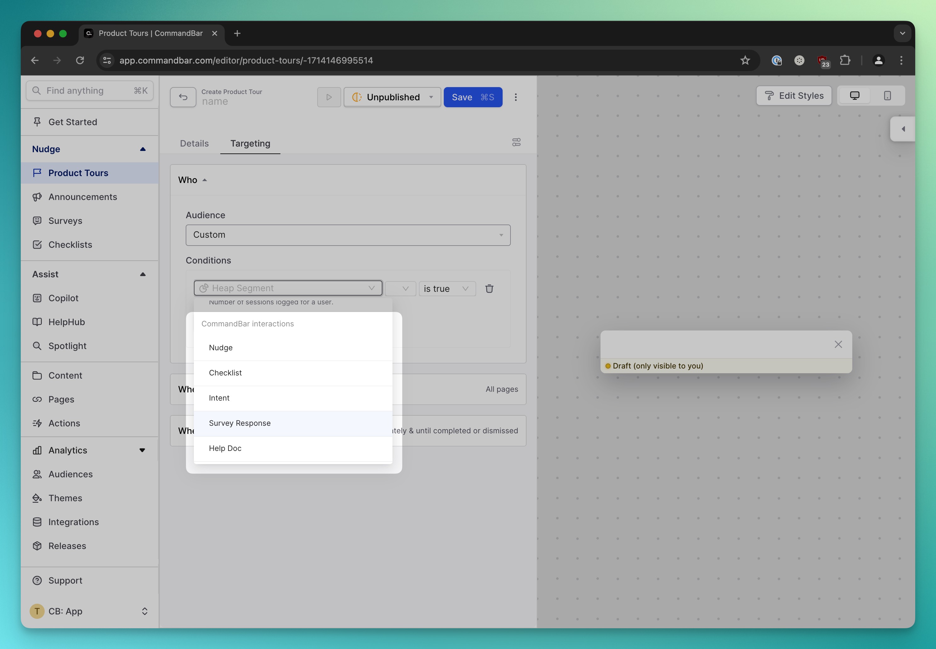
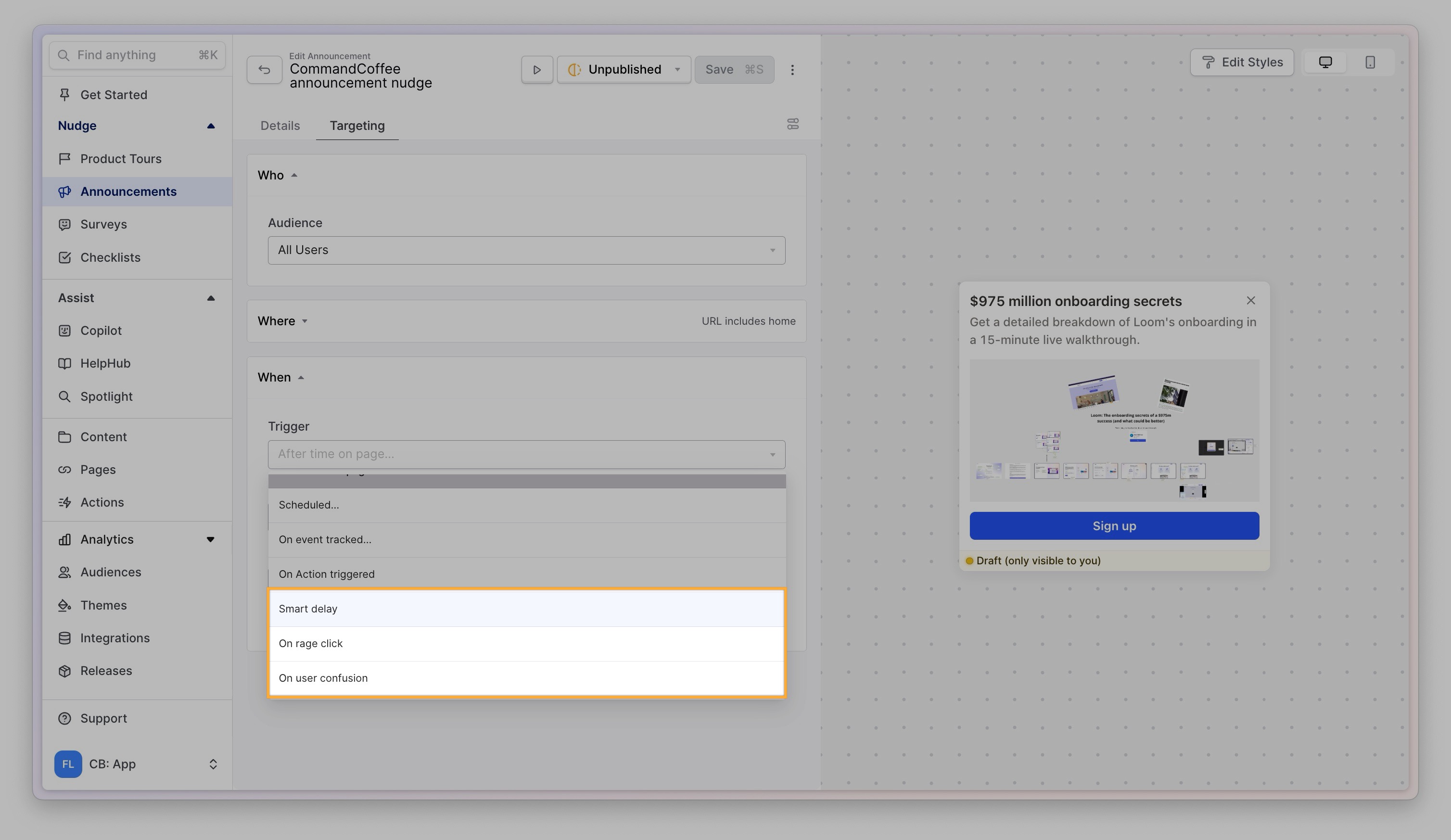
That's why we've built behavioral nudge triggers:
your image alt text

💭 User confusion: Triggers when users are confused and can't find what they're looking for (we base this on mouse movements and click patterns).

→ Use case: show a survey that asks "what are you trying to do" (you'll get really interesting results) or ask users to select from 3 use cases they might be interested in.

😡 Rage click: Triggers when users are angry and clicking in the same place more often than anyone reasonably should.

→ Use case: Offer up a therapy session with Copilot chat so they can ask a question (or maybe just suggest refreshing the tab)

🕕 Smart delay: Triggers when a user has settled into your product to make sure you don't interrupt them while doing something important.

→ Use case: Making sure webinar invites and other non-urgent announcements don't interrupt users while they're doing something important.

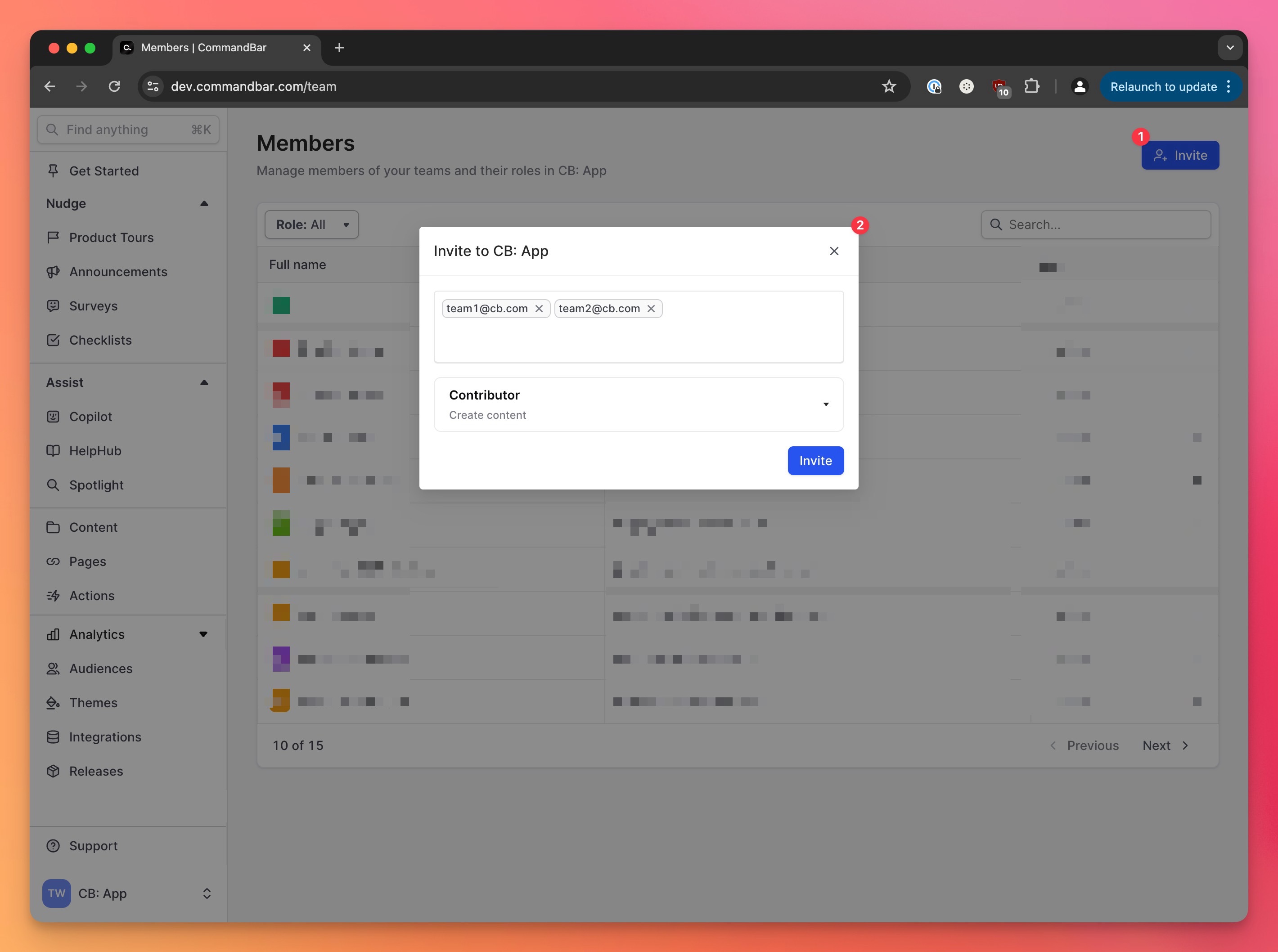
💌 Easier invites

Want to invite more colleagues to CommandBar? Thomas gave invites a refresh to help you work with your entire team to make life better for your users:
your image alt text

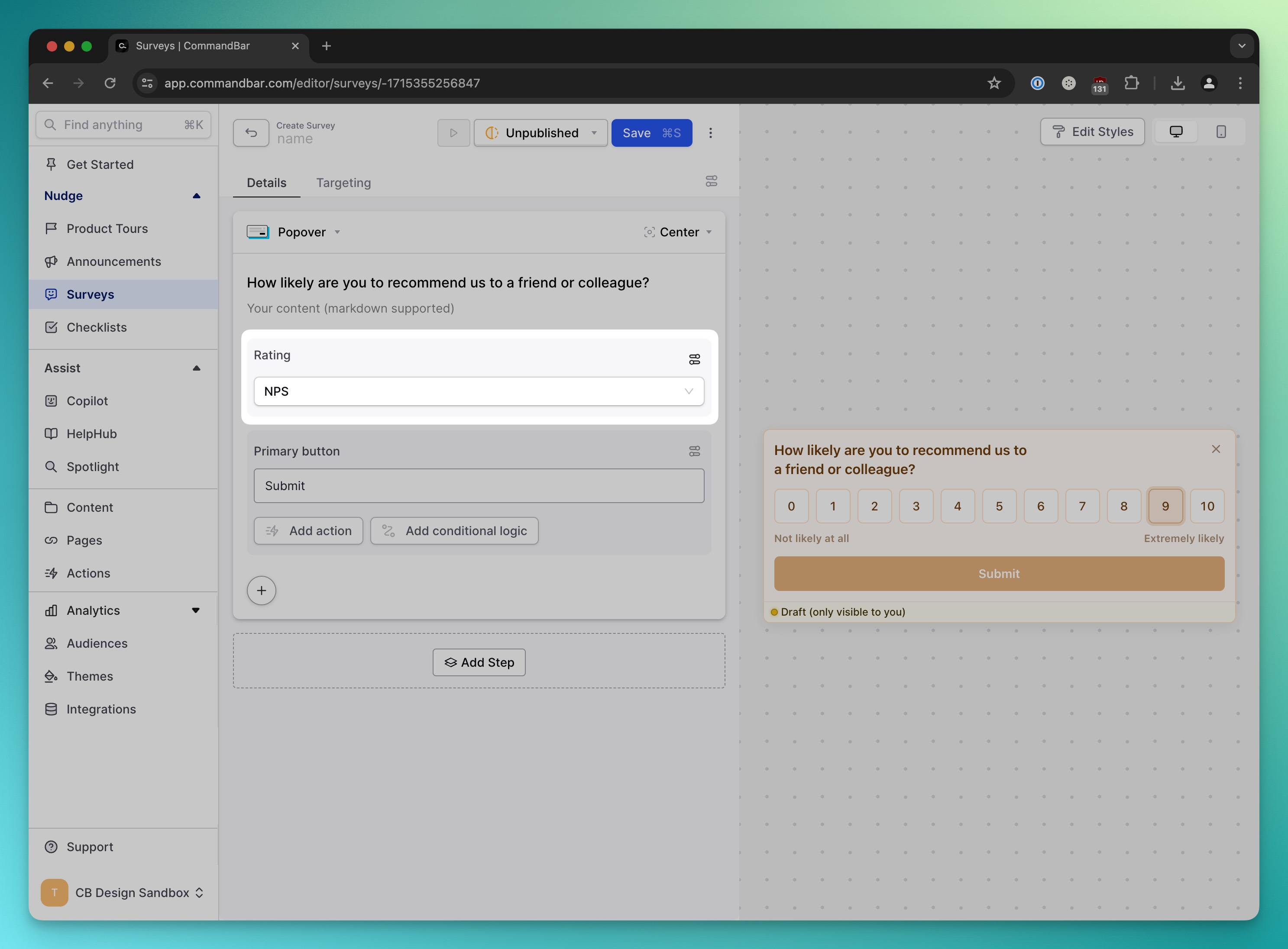
❓ Instant NPS surveys

Want to run an NPS survey? You could always do it, but had to manually build it. To make that more non-annoying, Shannon built an NPS block you can insert into nudges:
your image alt text

📍The Detail Dungeon

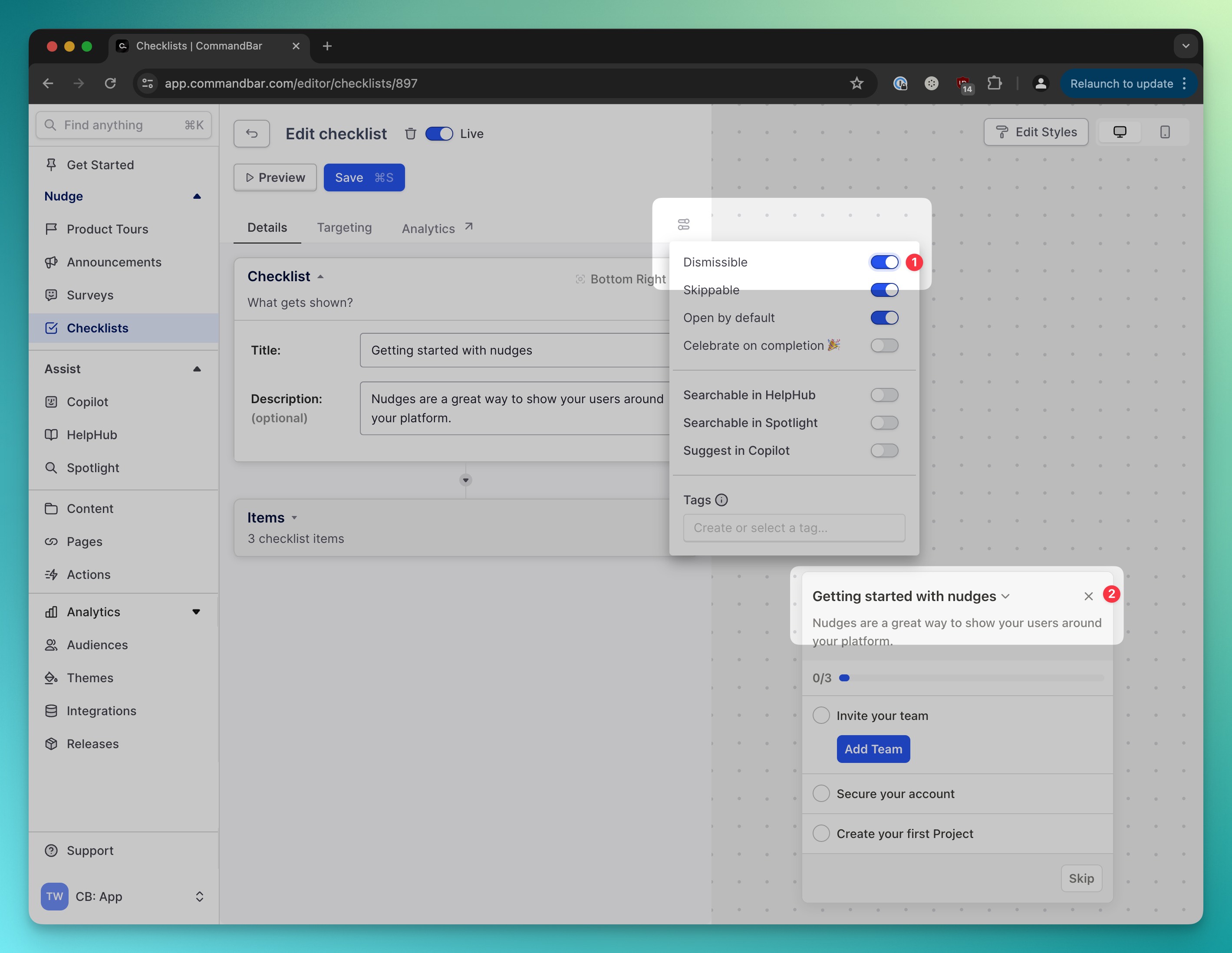
❎ Dismissible Checklists

In service of being more non-annoying, Shannon made Checklists dismissible. your image alt text
That's all we've got this week. I'll catch you in 2 weeks. As always: Keep it user-friendly!
May 7, 2024

⚒️ We've upgraded your nudges (again)

Maggie Pizzo's avatar
Michael Cavallaro's avatar
Paul Hultgren's avatar
Shannon McIntosh's avatar

Salutations!

Welcome to the world's best changelog, an award bestowed upon Commandbar by the guy who writes that exact changelog. If I had to describe the past two weeks of product updates with one word, it'd be... nudges!

Here's some cool stuff we've built:

🎯Behavioral targeting

Paul built a way to target nudges based on previous nudge interactions. This makes it easier to offer personalized experiences:

  • Positive NPS score? Ask for a G2 review.
  • Onboarding survey role = engineer? Show code integration guide.
  • Customer searched/asked about “CSV”? Show a Nudge when this feature is live!

And many, many more.

your image alt text

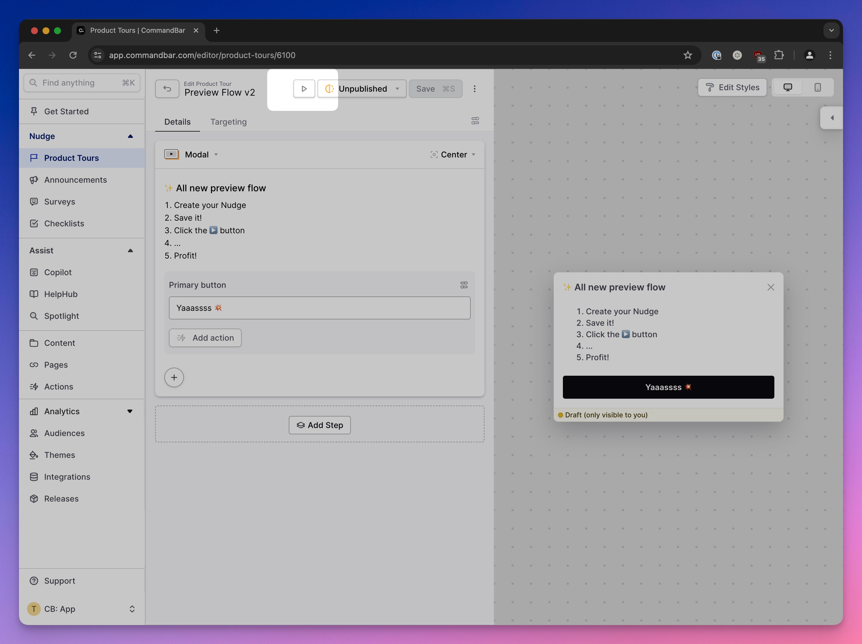
👀Previews

Mike made previewing nudges inside your product (or anywhere else) easier than ever: Just click this button, enter a URL and let the Chrome extension work its magic: your image alt text

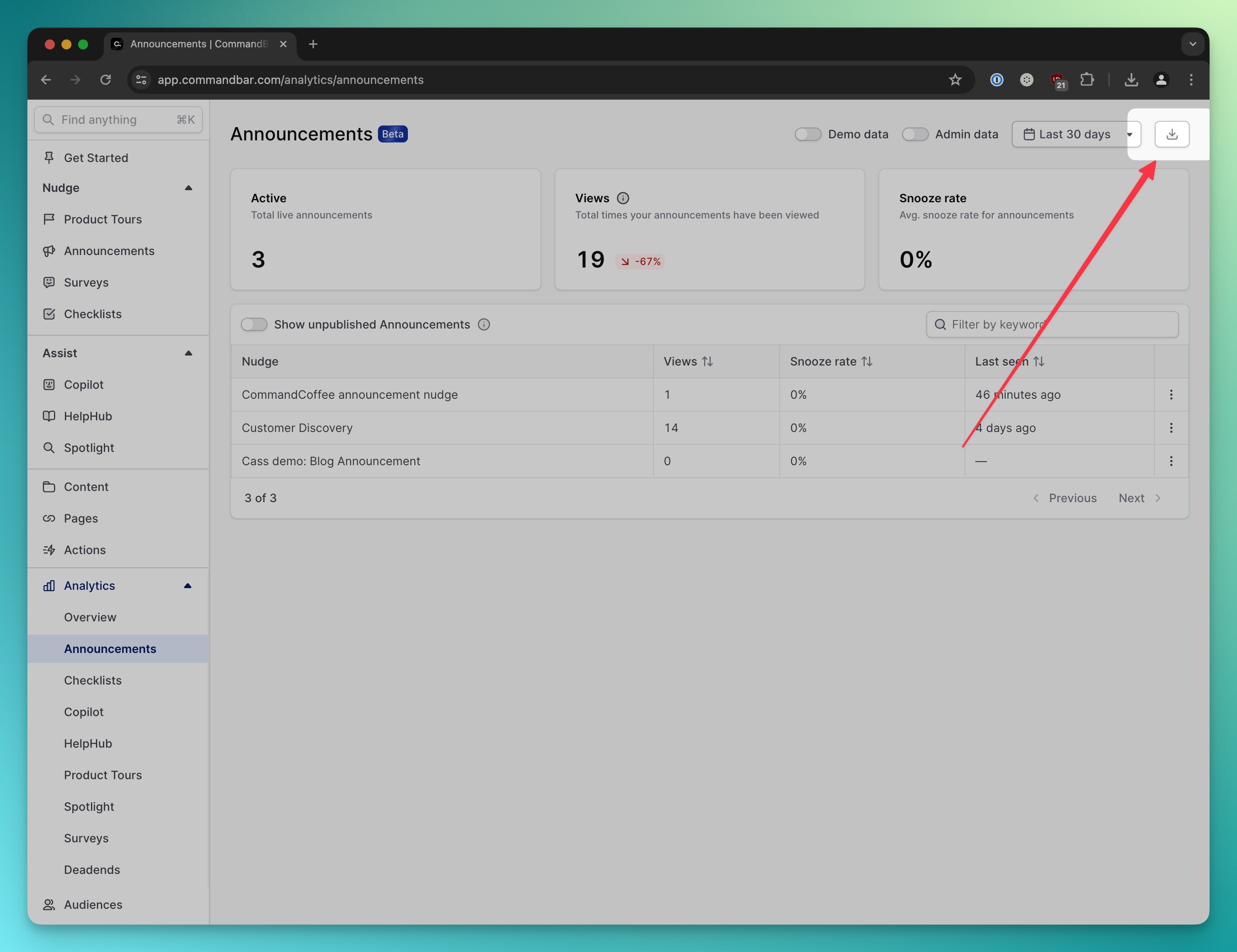
⬇️CSV Export

Want to brag about your CommandBar results in meetings? Thank Shannon for your next positive feedback—because you can now download analytics as a CSV with this little button:

your image alt text

📍 The Detail Dungeon

👤 Copilot avatar reset

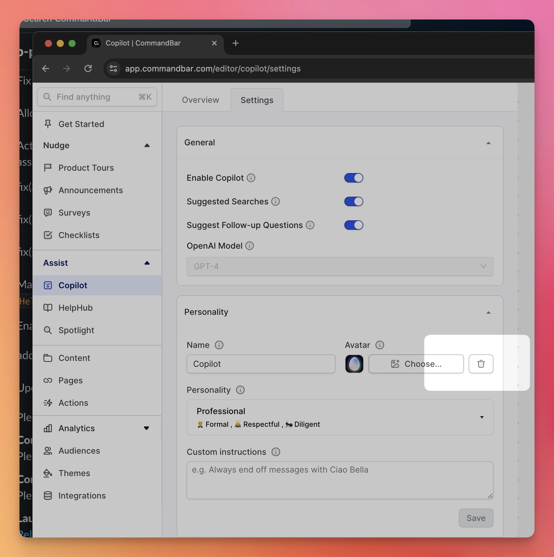
It's really funny to upload Danny DeVito as your Copilot avatar, but you don't want to ship that to users. That's why you can now reset Copilot's avatar to default (ty Shannon): your image alt text

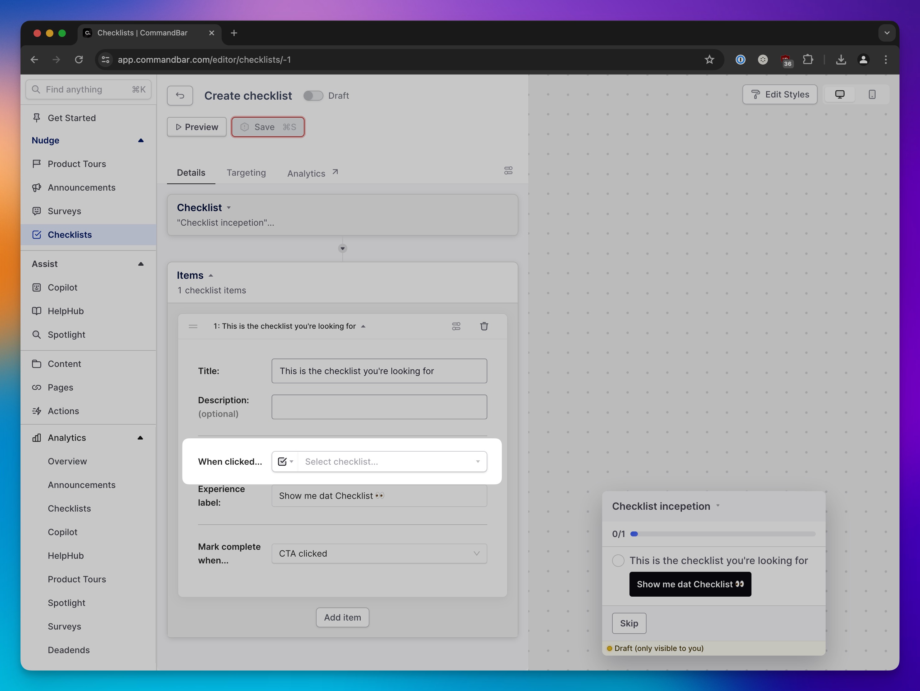
✅ Checklists²

Thanks to Maggie, checklists can now trigger other checklists, meaning you can trap users in an infinite checklist gauntlet. Or you could do the way-less- fun-but-way-more-useful thing of using a general checklist to launch a feature-specific one.

your image alt text

That's it for this installation of the changelog. As always: Keep it user-friendly!
April 21, 2024

💬Analytics szn

Gus Gordon's avatar
Nicola Badenhorst's avatar
Shannon McIntosh's avatar
Thomas Kainrad's avatar
Wes Feller's avatar

Howdy folks!

It's here. It's finally here. Get your partner in front of the screen and tell your kids The Lego Movie's over because you need the big screen. Yes, the CommandBar changelog is here.

💬Copilot Analytics

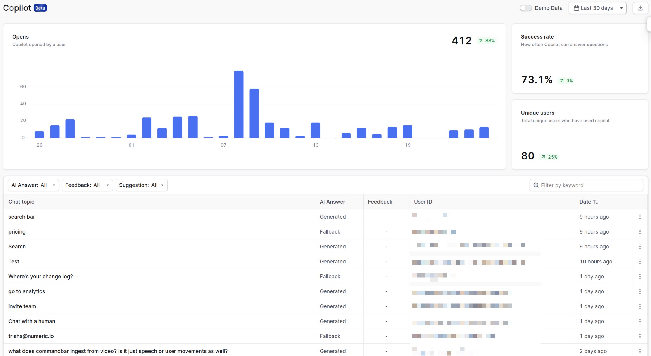
Your users are talking. Now you're listening: Copilot now has analytics:

your image alt text

Copilot has been around for a while, but we've now added the guac to the burrito by giving you the insights you need.

Now you can discover:

  • Replay all Copilot chats: See what users are asking for (and how) to discover user intent and surface what's unclear in your interface.
  • End user feedback (👍/ 👎 ) on all conversations: Find out where AI answers need work and optimize your docs.
  • All chats where AI used a fallback: When the AI couldn't generate an answer, you'll find out here to spot gaps in your documentation or find other errors.

Plus some quantitative data like opens, users and the success rate.

Sound good? Head to Copilot analytics and mine it for insights. Then look super smart in your next meeting. If anyone asks where those insights come from, a classic is "They were revealed to me in a dream."

Okay, career advice over.

📍The Detail Dungeon

As product nerds, we love the small details. Figured you might, too. So here are 3 cool things we shipped:

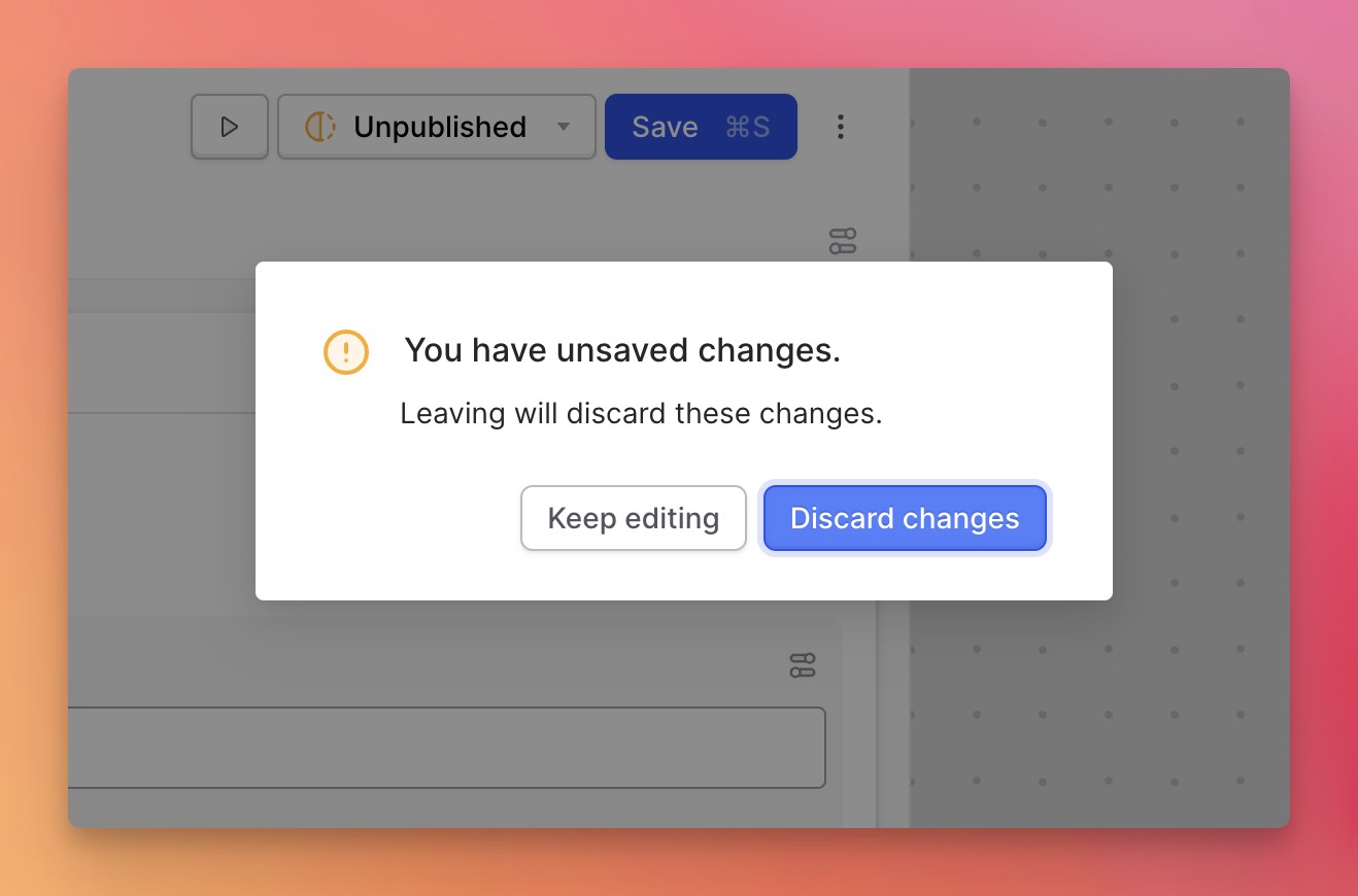
  • Back by popular demand: Thomas re-shipped the "unsaved changes" modal, which we had shipped and then unshipped.

your image alt text

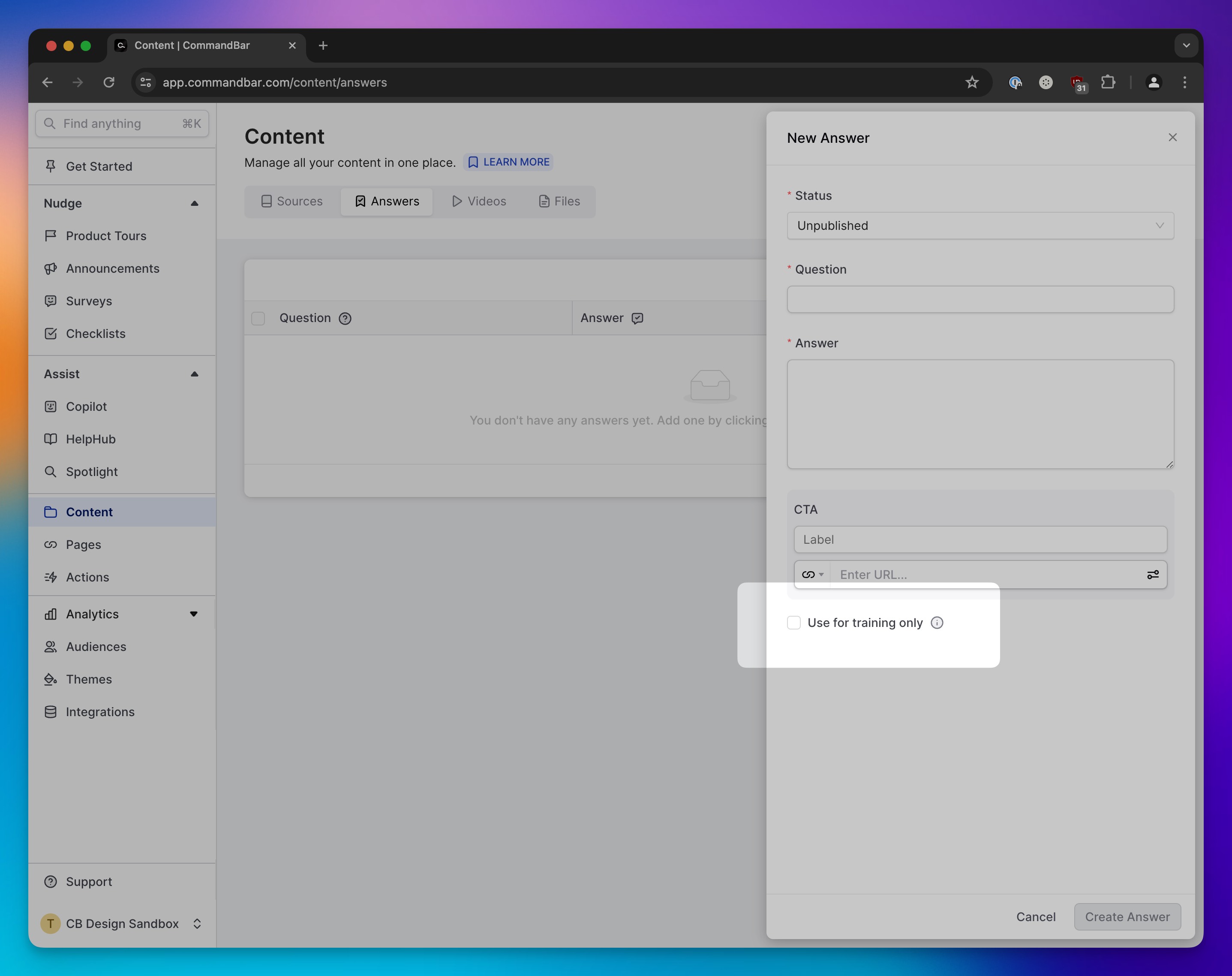
  • Gus added an option to make Copilot answers "training only," meaning it won't use them verbatim, but let AI use its own words.

your image alt text

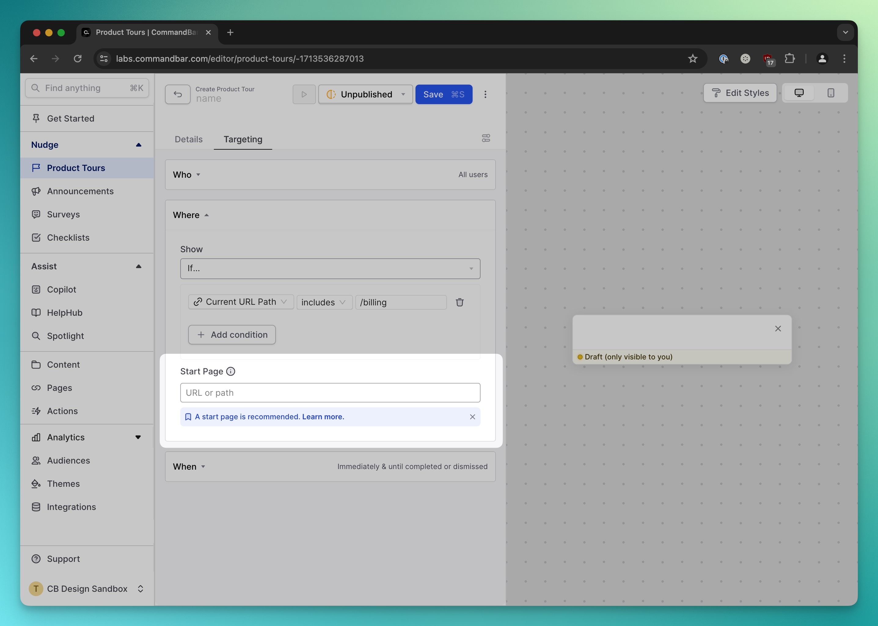
  • Thomas added a nice banner to make product tours more non-annoying by recommending a start page.

your image alt text

  • Gus enabled PDF upload for Copilot so you can turn any PDF into training content.

your image alt text

That's it for this edition of the changelog. As always: Keep is user-friendly.

desc
March 4, 2024

📊 New Analytics dashboards

Nicola Badenhorst's avatar
Paul Hultgren's avatar
Shannon McIntosh's avatar
Tyler Wanlass's avatar

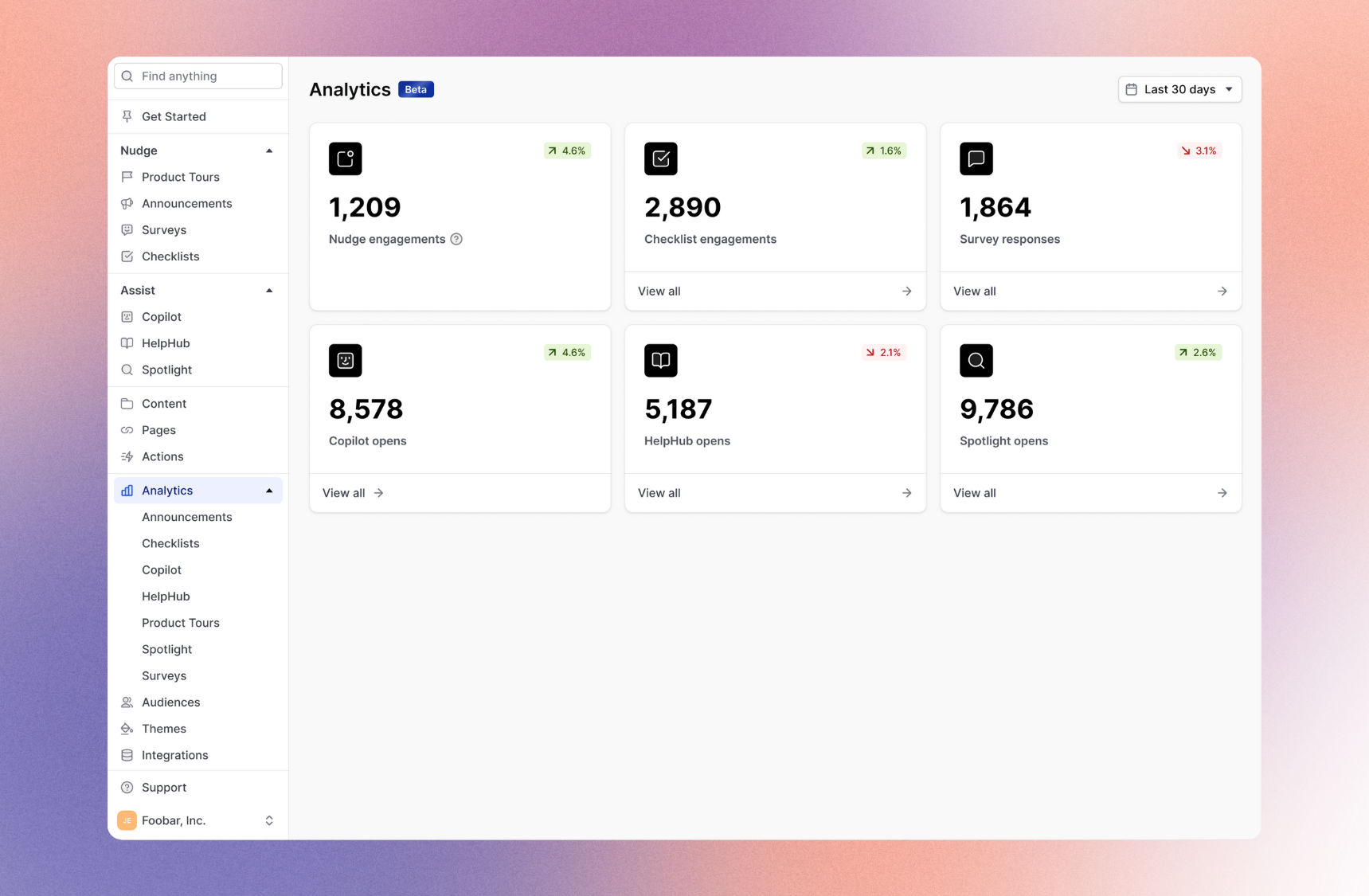
CommandBar is not an analytics company, but today we're doing our best impression: announcing our completely overhauled analytics system.

Every single dashboard is new. In addition to being new, they are also much better:

  1. More actionable summary statistics

  2. Real-time (less than 1 minute of latency from your users' browser to yours)

  3. Non-annoying graphs to measure non-annoying assistance

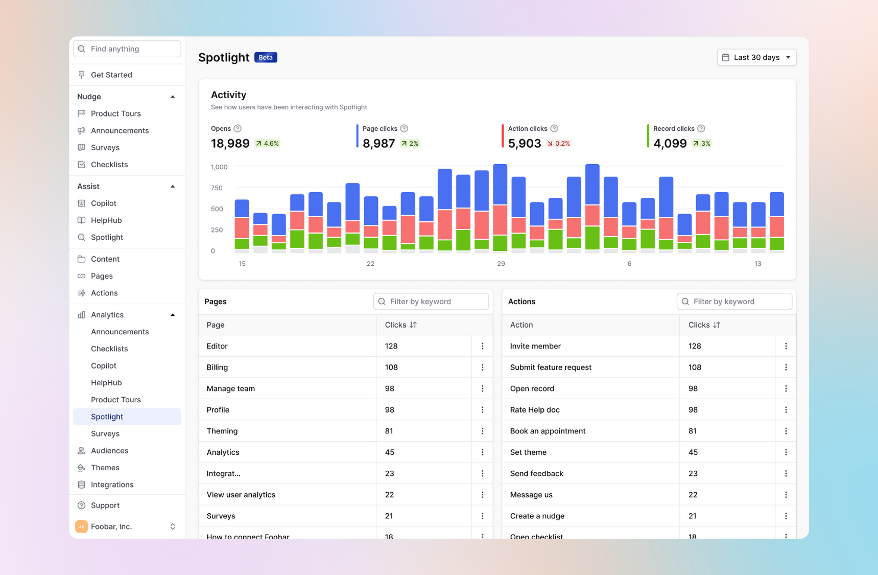
Spotlight

See what your users are searching for and understand points of confusion so you can tweak and improve the Actions used in Spotlight. 

your image alt text

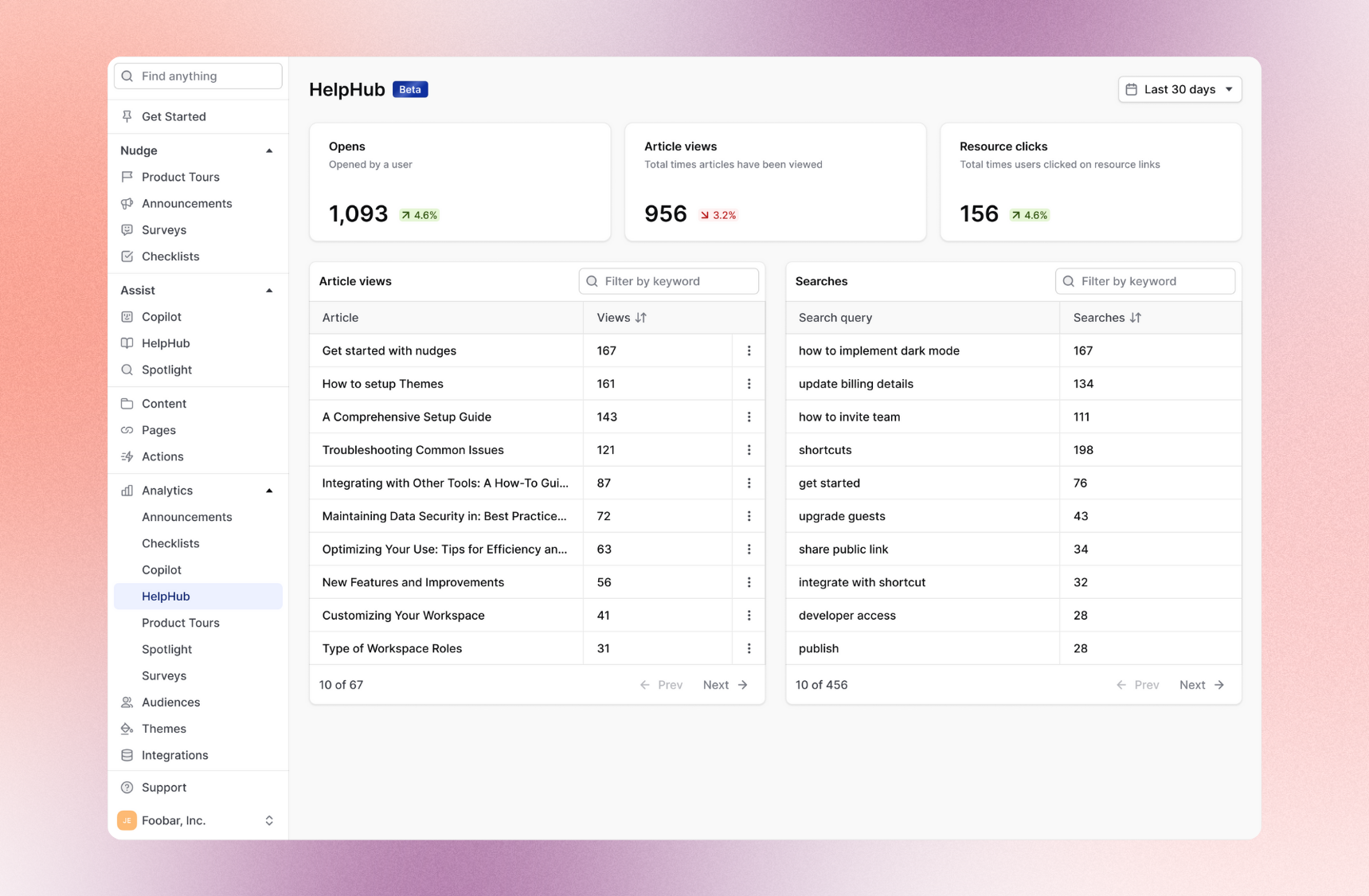
HelpHub (and of course, Copilot)

Check out how your help content is doing. Are users reading the articles? Are they opening up resource links? Are there any popular searches you don't yet have content for?

your image alt text

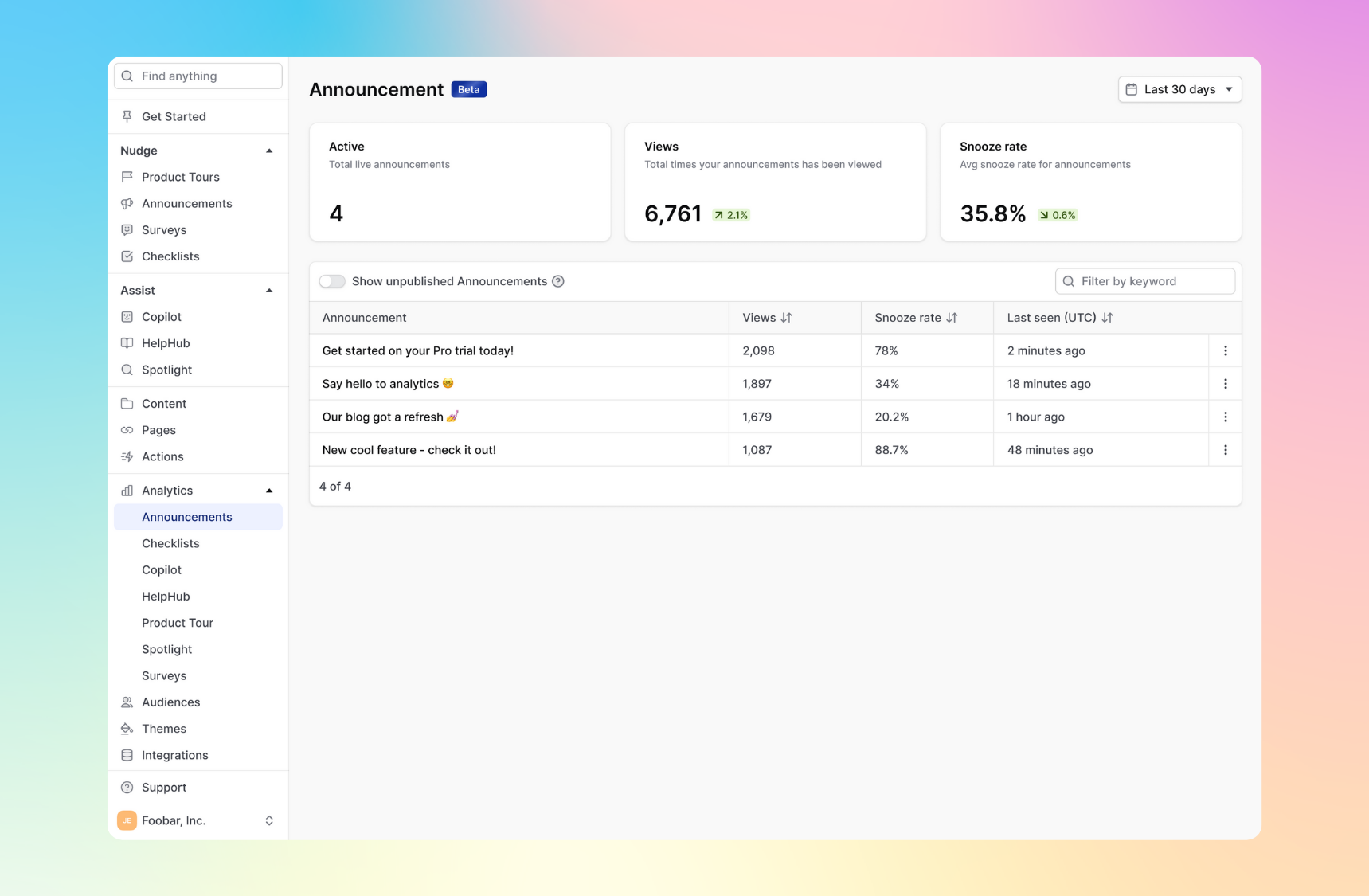
Announcement (and all other nudges) 

Are users seeing your nudges? How are they engaging with them?

your image alt text

desc
December 29, 2023

🦅 UI improvements, launch week, and prey birds

Maggie Pizzo's avatar
Shannon McIntosh's avatar
Wes Feller's avatar

Humblebrag alert. While most teams get lazy before the holidays, we were in full beast mode last week and launched five features that make nudges less annoying. That's on top of our regularly scheduled product improvements.

The CommandBar team also got together at our HQ in San Francisco to learn competitor empathy with the help of Peregrine Falcons. If that sounds unhinged, it's because it was. This LinkedIn post from our CEO, James, will clarify it.

I wanted the team to feel what it was like to have an apex predator rush towards them at full speed. I felt this would help them understand what it feels like to be in a competitive deal against CommandBar. “How are they moving so fast?” “Why are they so intense?” “I need to get out of here.”

🗓️ Launch week

We want you to stop annoying your users this holiday season with intrusive, untimely pop-ups. Here's how:

  • Snooze: your users can choose to snooze a nudge for a later time so they can still benefit from its contents without letting it get in the way.
  • Rage clicks: choose to display a nudge whenever your users seem frustrated and are repeatedly clicking an area on your product. This way, you can point them to the right place to get help.
  • Strike tracking: track users who seem annoyed based on how many times they've quickly closed a nudge without having had the chance to read it. You can use this dashboard to experiment with your nudges (customization, triggers, targeting) and improve your strike rate.
  • Rate limits: choose to limit the number of product tours, announcements, and surveys your users will see in a given period.
  • Draggable nudges: allow users to move around a nudge until they're ready to interact with it.

✅ HelpHub improvements

Kudos to Shannon for ensuring HelpHub now gracefully collapses when nudges or checklists are activated. RIP cluttered screens.

🍫 Simulate mode toolbar enhancements

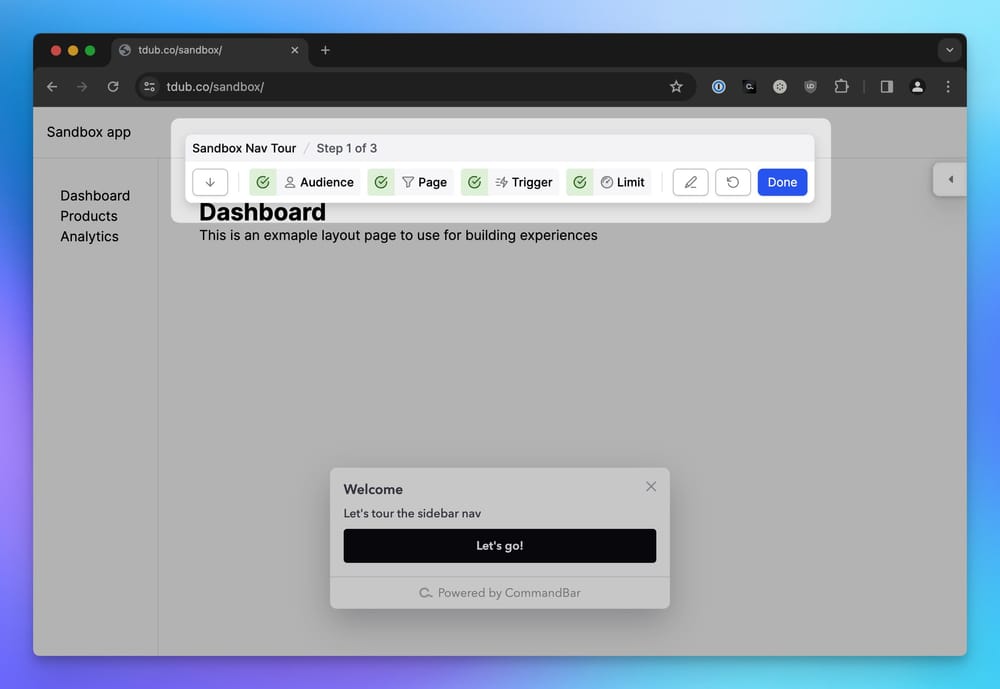
Simulate mode for a nudge

Thanks to Wes, the toolbar now shows step counts in simulations, and a nifty pencil icon for quick edits. Making tour building twice as fast and half as frustrating.

😵‍💫 Nudge-ception handled

Nudges triggering other nudges will now show a simulate mode bar for those lost in the nudge matrix.

🔃 HubSpot two-way integration

We're now syncing data in both directions.

✨ Unified action menus

Maggie has worked her magic, and now there's a consistent, organized menu for actions across nudges, checklists, and more.

That's it for today. We'll see you soon.

desc
August 25, 2023

New Integration: Add Loom to Product Tours

Shannon McIntosh's avatar

Product Tours are fantastic for showing users around your product. They can be sticky, ephemeral, or even circumstantial based on targeted user actions. But sometimes, a little nudge needs a little more context.

That’s where a quick Loom would be super handy, right?

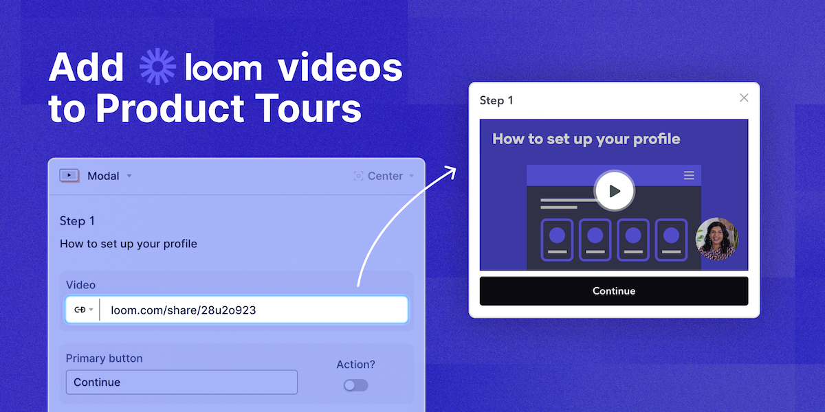
Well, we’ve made it easier than ever to share loom videos in Product Tours!

Simply paste your loom link into the video block thingy, and we'll handle all the technical bits to make sure your loom videos are playable right within the step thingy.

Why is this Important?

  • Nudging vs Showing: Guiding users on product walkthroughs is incredibly helpful for onboarding, but let’s be honest, there’s only so much you can squeeze in those little modals. Giving users the opportunity to watch a feature being explained is so much more powerful.
  • Personalized Video Tours: With the launch of our Magic Tour Links, product tours can now be created and shared uniquely customized to individual users. With Loom links now auto-magically embedding playable videos, you have the flexibility to support your customers in even more engaging and delightful ways.

Give it a spin: To get started, go to: https://app.commandbar.com/editor/nudges > Paste the Loom link into a Video Nudge > Magic happens 🙌

March 7, 2023

HelpHub

Gus Gordon's avatar
Kyle Patel's avatar
Pia Leung's avatar
Richard Freling's avatar
Shannon McIntosh's avatar
Vinay Ayyala's avatar

HelpHub is three things:

  1. Plug-and-play semantic search across your help docs

  2. Instant answers to frequently asked questions (curated and via AI)

  3. All packaged in a beautiful new in-app widget.

And it plays nicely with the Bar, Nudges, and Questlists.

With HelpHub, your users can get unstuck and get the help they need without exiting your app's flow. Because of this, when HelpHub is adopted, our customers typically see their conversion rates increase.

It's easy to integrate your existing help documents into HelpHub. We currently support Zendesk, Intercom, GitBook, and many more providers. For the full list of integrations, see our Adding help documents documentation page.

To turn on HelpHub, head into the editor and go into the "HelpHub" section on the right.

January 8, 2023

Rotating Placeholders

Shannon McIntosh's avatar

Now, any placeholders that you add to CommandBar via the settings panel will rotate when the input is selected. This can give your users a better understanding of what they can do with CommandBar, without having to open and close the bar to get different examples.

Rotating placeholders work with both the modal and the inline bar. When an inline bar is used, the rotation will only occur if the input is selected.

To add placeholders to your CommandBar, head into the settings panel in your editor and add a few placeholders. If you have placeholders already, the rotation will work as-is.

December 19, 2022

New admin dashboard

Shannon McIntosh's avatar

We just redesigned our admin dashboard to make it more accessible and easier to use. Now, you'll see analytics right in front, plus a separate integrations tab and a more prominent standalone editor button.

In the integrations tab, you can connect all of your integrations, including Segment, Intercom, Zendesk, and more. Since everything is in one place now, it is easy to check what you have connected and what's not yet connected.

Additionally, we've made the "Open Editor" button more prominent. Give the new dashboard (as well as the new standalone editor) a shot, and let us know what you think!

Check out the new admin dashboard

December 12, 2022

Nudge form factors

Kyle Patel's avatar
Shannon McIntosh's avatar
Wes Feller's avatar

We have a big new feature: nudge form factors! Now, nudges can take on new form factors, including modals, popovers, and pins:

  • As a modal, the nudge will pop up in the center of the page and overlay all other elements on the page. With this form factor, the user must click out of it to proceed. Use this form factor to show important messages that users need to take action on. This is also the simplest form factor - the nudge just shows up in the middle of your screen.

  • As a popover, the nudge will hover over the page, but other elements on the page can still be clicked. Popovers can appear in the top left, top right, bottom left, and bottom right of the page and will push other nudges to the side when they appear. Popovers are great for most notifications, like "toast"-style popups — users can either dismiss them or click a button that you have provided. Also, note that popovers are draggable — for example, you could put a video or image in the nudge, so users can see rich content without exiting their existing UI flow.

  • As a pin, nudges will "stick" to elements on the page. This is similar to a popover in that you can add a button to it, but it can be used to point out buttons, inputs, etc., that the user should pay attention to. These are great when combined with Questlists — they can be strung together to form an onboarding flow. Additionally, these are great for pointing out new features to users.

As before, you can create multiple nudges for many different scenarios in your app. Try creating a nudge, and let us know what you think!

December 4, 2022

Analytics events for previews

Shannon McIntosh's avatar

Now, you'll get analytics events for previews. The events include the amount of time the user has viewed the preview, as well, so you can get a sense of how long your users spend reading previews.

You can also use this information to filter by the length of time your users have viewed previews. For example, you may decide to filter out preview events where the user has spent only a second or two viewing the preview.

See our SDK docs for more information.

December 1, 2022

Nudge templates

Shannon McIntosh's avatar

To make creating nudges easier, we're adding some pre-built templates that allow you to more easily create a nudge. We'll be adding more templates in the future, but we're starting:

  • Announcement, which is great for pointing out something important to users. For example, you could use this to tell users about a new item they need to take action on, or something like a required password change.

  • Feature highlight, which pins to an element on your page and can point out a feature to users. It attaches itself to any element on your page.

  • Upgrade nudge, which is a popover nudge that has a button. This is great for pushing users to perform some action, and brings the CTA front and center for them.

  • Simple notification, which is a popover nudge with no action. Use this as a toast-style notification to let users know non-critical information.

Remember that these are just templates — they can be customized after you create them in any way, including adding images, help documents, and other rich content.

November 28, 2022

Nudge actions are now optional

Shannon McIntosh's avatar

To further expand the ability of nudges, we've made nudge actions optional. Even though this is a simple change, it opens nudges up to be used for notifications. These are great when you want to show the user some information, but the user doesn't necessarily need to act on that information.